14.1. Matplotlib#
import matplotlib.pyplot as plt
%matplotlib inline
x = list(range(10))
y = [ele*ele for ele in x]
x
[0, 1, 2, 3, 4, 5, 6, 7, 8, 9]
y
[0, 1, 4, 9, 16, 25, 36, 49, 64, 81]
# Method 1
# A simple plot
plt.plot(x,y)
[<matplotlib.lines.Line2D at 0x7f8b50d864e0>]
plt.plot(x,y, 'r.')
[<matplotlib.lines.Line2D at 0x7f8b4eb219a0>]

plt.plot(x,y,
         linewidth=2,
         linestyle='-.',
         color='red',
         marker='o',
         markersize=20,
         markeredgewidth=2,
         markeredgecolor='lawngreen',
         markerfacecolor='black',
)
[<matplotlib.lines.Line2D at 0x7f8b4eb5fbc0>]

# Shortcut for controlling the line style and color
# plt.plot(x,y, 'y--')
# https://matplotlib.org/stable/api/_as_gen/matplotlib.axes.Axes.plot.html

plt.plot(x,y,
         linewidth=1,
         linestyle='--',
         color='red',
         marker='o',
         markersize=15,
         markeredgewidth=3,
         markeredgecolor='blue',
         markerfacecolor='black',
         fillstyle='left')
[<matplotlib.lines.Line2D at 0x7f8b50c3e0c0>]

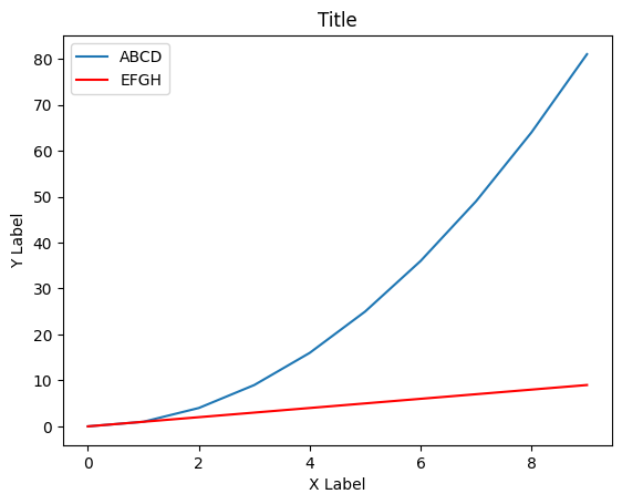
# Adding labels and titles
plt.plot(x,y)
plt.plot(x,x, 'r')
plt.xlabel('X Label')
plt.ylabel('Y Label')
plt.title('Title')
plt.legend(['ABCD', 'EFGH'], loc='best')
<matplotlib.legend.Legend at 0x7f8b4eb23140>
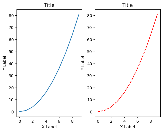
# Subplots -- have multiple plots
plt.subplot(1,2,1)
plt.plot(x,y)
plt.xlabel('X Label')
plt.ylabel('Y Label')
plt.title('Title')

plt.subplot(1,2,2)
plt.plot(x,y, '--r')
plt.xlabel('X Label')
plt.ylabel('Y Label')
plt.title('Title')
Text(0.5, 1.0, 'Title')
# Subplots -- have multiple plots
plt.subplot(2,2,1)
plt.plot(x,y)
plt.xlabel('X Label')
plt.ylabel('Y Label')
plt.title('1')

plt.subplot(2,2,2)
plt.plot(x,y, 'r')
plt.xlabel('X Label')
plt.ylabel('Y Label')
plt.title('2')

plt.subplot(2,2,3)
plt.plot(x,y)
plt.xlabel('X Label')
plt.ylabel('Y Label')
plt.title('3')

plt.subplot(2,2,4)
plt.plot(x,y, 'r')
plt.xlabel('X Label')
plt.ylabel('Y Label')
plt.title('4')

plt.tight_layout()
# Method 2 -- Object Oriented way
fig = plt.figure()

axes = fig.add_axes([0.1, 0.1, 0.8, 1])
# rect : sequence of float
# The dimensions [left, bottom, width, height] of the new axes.
# All quantities are in fractions of figure width and height.
fig = plt.figure()

axes = fig.add_axes([0.1, 0.1, 0.5, 1])
# rect : sequence of float
# The dimensions [left, bottom, width, height] of the new axes.
# All quantities are in fractions of figure width and height.
fig = plt.figure()

axes = fig.add_axes([0.1, 0.1, 1, 1])
# rect : sequence of float
# The dimensions [left, bottom, width, height] of the new axes.
# All quantities are in fractions of figure width and height.

axes.plot(x,y)
axes.set_xlabel('X Label')
axes.set_ylabel('Y Label')
axes.set_title('Title')
Text(0.5, 1.0, 'Title')
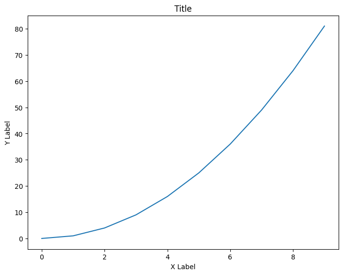
fig = plt.figure()

axes1 = fig.add_axes([0, 0, 1, 1])
axes2 = fig.add_axes([0.5, 0.1, 1, 1])
# rect : sequence of float
# The dimensions [left, bottom, width, height] of the new axes.
# All quantities are in fractions of figure width and height.
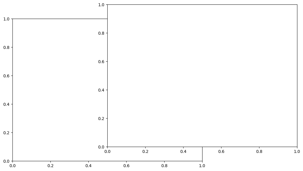
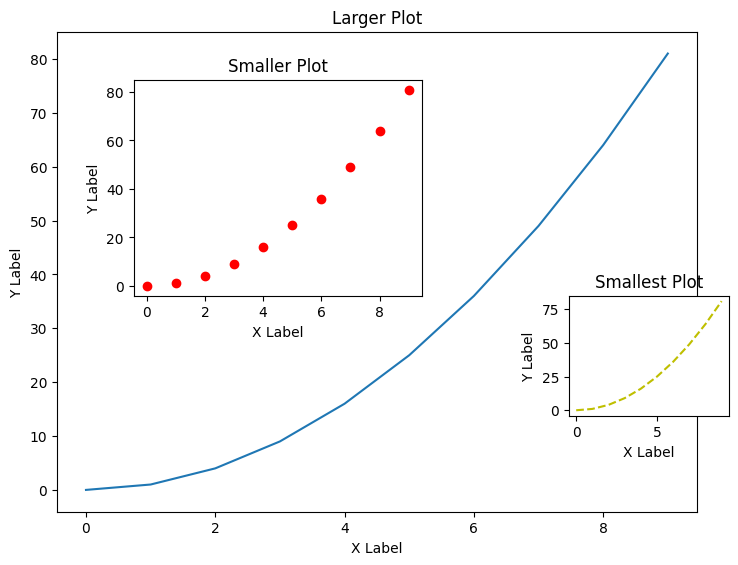
fig = plt.figure()

axes1 = fig.add_axes([0, 0, 1, 1])
axes2 = fig.add_axes([0.12, 0.45, 0.45, 0.45])
# rect : sequence of float
# The dimensions [left, bottom, width, height] of the new axes.
# All quantities are in fractions of figure width and height.

axes1.plot(x,y)
axes1.set_xlabel('X Label')
axes1.set_ylabel('Y Label')
axes1.set_title('Larger Plot')

axes2.plot(x,y, 'ro')
axes2.set_xlabel('X Label')
axes2.set_ylabel('Y Label')
axes2.set_title('Smaller Plot')

axes3 = fig.add_axes([0.8, 0.2, 0.25, 0.25])
axes3.plot(x,y, 'y--')
axes3.set_xlabel('X Label')
axes3.set_ylabel('Y Label')
axes3.set_title('Smallest Plot')
Text(0.5, 1.0, 'Smallest Plot')
y
[0, 1, 4, 9, 16, 25, 36, 49, 64, 81]
fig, axes = plt.subplots(nrows=2, ncols=2)
plt.tight_layout()
axes
array([[<Axes: >, <Axes: >],
       [<Axes: >, <Axes: >]], dtype=object)
print(axes)
[[<Axes: > <Axes: >]
 [<Axes: > <Axes: >]]
type(axes)
numpy.ndarray
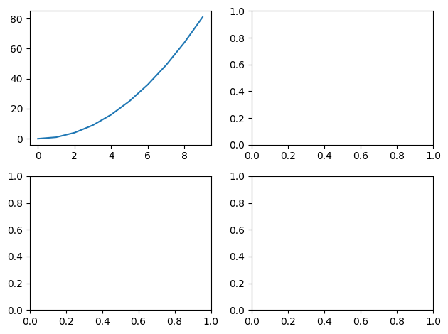
fig, axes = plt.subplots(nrows=2, ncols=2)


axes[0][0].plot(x,y)
plt.tight_layout()
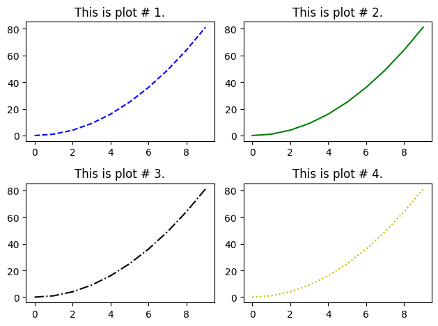
fig, axes = plt.subplots(nrows=2, ncols=2)

line_styles = ['', '--', '-', '-.', ':']
colors = ['', 'b', 'g', 'k', 'y']
for idx, ax in enumerate(axes.reshape(-1), 1):
    ax.plot(x,y, color=colors[idx], linestyle=line_styles[idx])
    ax.set_title(f'This is plot # {idx}.')
plt.tight_layout()
axes[0][0]
<Axes: title={'center': 'This is plot # 1.'}>
axes.reshape(-1)
array([<Axes: title={'center': 'This is plot # 1.'}>,
       <Axes: title={'center': 'This is plot # 2.'}>,
       <Axes: title={'center': 'This is plot # 3.'}>,
       <Axes: title={'center': 'This is plot # 4.'}>], dtype=object)
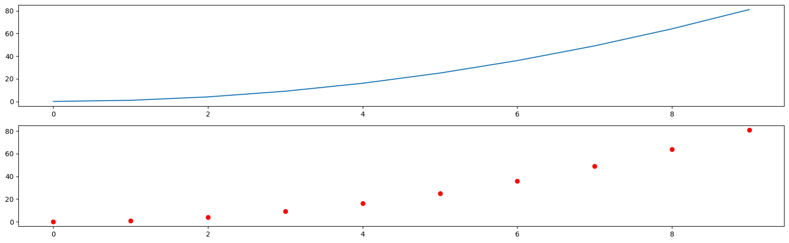
fig, axes = plt.subplots(nrows=2, ncols=1, figsize=(16,5))
axes[0].plot(x,y)
axes[1].plot(x,y, 'ro')
plt.tight_layout()

# figsize : (float, float), optional, default: None
# width, height in inches. If not provided, defaults to [6.4, 4.8]
# fig.savefig('figure') #default is png
# fig.savefig('figure.jpeg')
# fig.savefig('figure2', dpi=300)
fig.savefig('figure2svg.svg', dpi=300)
fig = plt.figure()

axes = fig.add_axes([0.1, 0.1, 1, 1])
# rect : sequence of float
# The dimensions [left, bottom, width, height] of the new axes.
# All quantities are in fractions of figure width and height.
y3 = [ele*3 for ele in y]
axes.plot(x,y, label='x,y')
axes.plot(x,y3, label='x,y**3')
axes.set_xlabel('X Label')
axes.set_ylabel('Y Label')
axes.set_title('Title')
axes.legend(loc='lower right', fontsize=24)
# axes.legend(loc=1)
axes.legend(loc=[0.5,0.5])

# Location String 	Location Code
# 'best' 	0
# 'upper right' 	1
# 'upper left' 	2
# 'lower left' 	3
# 'lower right' 	4
# 'right' 	5
# 'center left' 	6
# 'center right' 	7
# 'lower center' 	8
# 'upper center' 	9
# 'center' 	10
<matplotlib.legend.Legend at 0x7f8b4e2bd5b0>
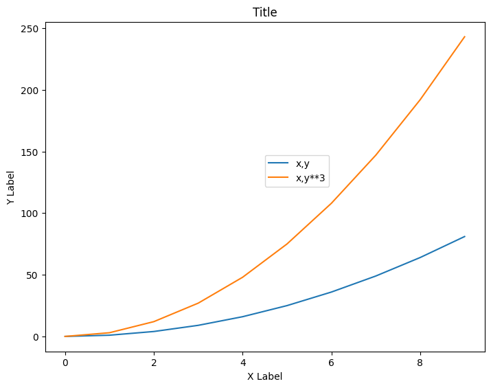
fig = plt.figure()

axes = fig.add_axes([0.1, 0.1, 1, 1])
# axes.plot(x,y, 'r')
# axes.plot(x,y, color='yellow')

# axes.plot(x,y, 'k')
# axes.plot(x,y, color='black')

# # https://www.color-hex.com/
axes.plot(x,y, color='#F75D5D', linewidth=10)
[<matplotlib.lines.Line2D at 0x7f8b4e0116d0>]
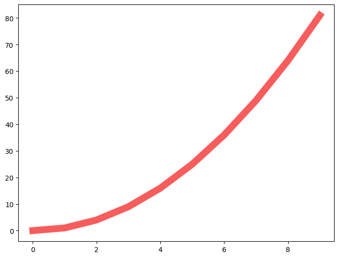
fig = plt.figure()

axes = fig.add_axes([0.1, 0.1, 1, 1])
# axes.plot(x,y, 'r', linewidth=4)


axes.plot(x,y, 'o--b', lw=4, alpha=0.1, ms=20)
[<matplotlib.lines.Line2D at 0x7f8b4e072b10>]
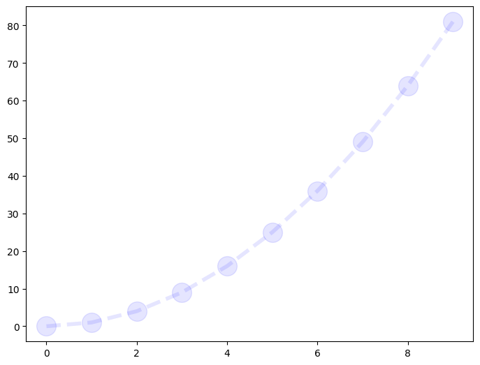
fig = plt.figure()

axes = fig.add_axes([0.1, 0.1, 1, 1])
axes.plot(x,y, 'r-.', lw=5, linestyle=':')
# Linestyle 	Description
# '-' or 'solid' 	solid line
# '--' or 'dashed' 	dashed line
# '-.' or 'dashdot' 	dash-dotted line
# ':' or 'dotted' 	dotted line
# 'None' or ' ' or '' 	draw nothing
/tmp/ipykernel_9825/75132765.py:4: UserWarning: linestyle is redundantly defined by the 'linestyle' keyword argument and the fmt string "r-." (-> linestyle='-.'). The keyword argument will take precedence.
  axes.plot(x,y, 'r-.', lw=5, linestyle=':')
[<matplotlib.lines.Line2D at 0x7f8b4eb7ed50>]
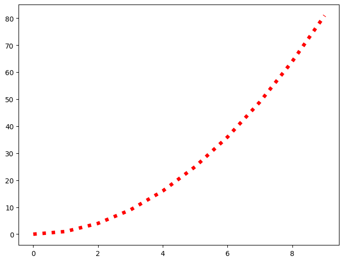
fig = plt.figure()

axes = fig.add_axes([0.1, 0.1, 1, 1])
# axes.plot(x,y, marker='o')
axes.plot(x,y, ' b', marker='^', markersize=10)
#https://matplotlib.org/3.1.1/api/markers_api.html
[<matplotlib.lines.Line2D at 0x7f8b4df70890>]

fig = plt.figure()

axes = fig.add_axes([0.1, 0.1, 1, 1])
# axes.plot(x,y, 'b', marker='o', markersize=10, markerfacecolor='red')
axes.plot(x,y, 'b', marker='o', markersize=30, markerfacecolor='yellow', markeredgewidth=3, markeredgecolor='k')
#https://matplotlib.org/3.1.1/api/markers_api.html
[<matplotlib.lines.Line2D at 0x7f8b4df9fbc0>]
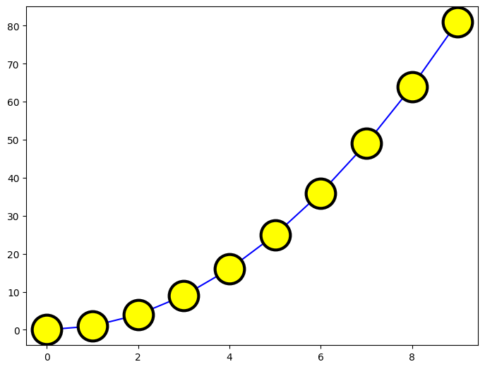
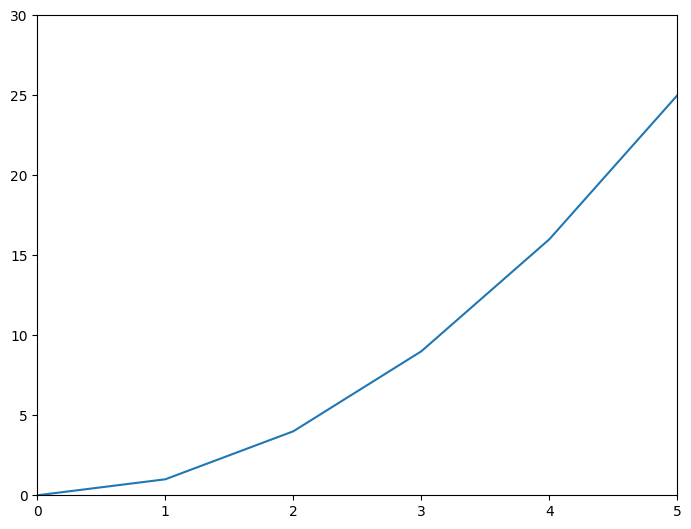
fig = plt.figure()

axes = fig.add_axes([0, 0, 1, 1])
axes.plot(x,y)
axes.set_xlim([0,5])
axes.set_ylim([0,30])
(0.0, 30.0)
# https://github.com/rougier/matplotlib-tutorial
# https://medium.com/@kapil.mathur1987/matplotlib-an-introduction-to-its-object-oriented-interface-a318b1530aed
import numpy as np

t = 2*np.pi/3
plt.plot([t,t],[0,np.cos(t)], color ='blue', linewidth=1.5, linestyle="--")
plt.scatter([t,],[np.cos(t),], 50, color ='blue')

plt.annotate(r'$\sin(\frac{2\pi}{3})=\frac{\sqrt{3}}{2}$',
             xy=(t, np.sin(t)), xycoords='data',
             xytext=(+10, +30), textcoords='offset points', fontsize=16,
             arrowprops=dict(arrowstyle="->", connectionstyle="arc3,rad=.2"))

plt.plot([t,t],[0,np.sin(t)], color ='red', linewidth=1.5, linestyle="--")
plt.scatter([t,],[np.sin(t),], 50, color ='red')

plt.annotate(r'$\cos(\frac{2\pi}{3})=-\frac{1}{2}$',
             xy=(t, np.cos(t)), xycoords='data',
             xytext=(-90, -50), textcoords='offset points', fontsize=16,
             arrowprops=dict(arrowstyle="->", connectionstyle="arc3,rad=.2"))
Text(-90, -50, '$\\cos(\\frac{2\\pi}{3})=-\\frac{1}{2}$')

import matplotlib.pyplot as plt
import pandas as pd
import numpy as np
data = pd.read_csv("https://raw.githubusercontent.com/fivethirtyeight/data/master/airline-safety/airline-safety.csv")
# Get figure object and an array of axes objects
fig, arr_ax = plt.subplots(2, 2)
display(data)
| airline | avail_seat_km_per_week | incidents_85_99 | fatal_accidents_85_99 | fatalities_85_99 | incidents_00_14 | fatal_accidents_00_14 | fatalities_00_14 | |
|---|---|---|---|---|---|---|---|---|
| 0 | Aer Lingus | 320906734 | 2 | 0 | 0 | 0 | 0 | 0 |
| 1 | Aeroflot* | 1197672318 | 76 | 14 | 128 | 6 | 1 | 88 |
| 2 | Aerolineas Argentinas | 385803648 | 6 | 0 | 0 | 1 | 0 | 0 |
| 3 | Aeromexico* | 596871813 | 3 | 1 | 64 | 5 | 0 | 0 |
| 4 | Air Canada | 1865253802 | 2 | 0 | 0 | 2 | 0 | 0 |
| 5 | Air France | 3004002661 | 14 | 4 | 79 | 6 | 2 | 337 |
| 6 | Air India* | 869253552 | 2 | 1 | 329 | 4 | 1 | 158 |
| 7 | Air New Zealand* | 710174817 | 3 | 0 | 0 | 5 | 1 | 7 |
| 8 | Alaska Airlines* | 965346773 | 5 | 0 | 0 | 5 | 1 | 88 |
| 9 | Alitalia | 698012498 | 7 | 2 | 50 | 4 | 0 | 0 |
| 10 | All Nippon Airways | 1841234177 | 3 | 1 | 1 | 7 | 0 | 0 |
| 11 | American* | 5228357340 | 21 | 5 | 101 | 17 | 3 | 416 |
| 12 | Austrian Airlines | 358239823 | 1 | 0 | 0 | 1 | 0 | 0 |
| 13 | Avianca | 396922563 | 5 | 3 | 323 | 0 | 0 | 0 |
| 14 | British Airways* | 3179760952 | 4 | 0 | 0 | 6 | 0 | 0 |
| 15 | Cathay Pacific* | 2582459303 | 0 | 0 | 0 | 2 | 0 | 0 |
| 16 | China Airlines | 813216487 | 12 | 6 | 535 | 2 | 1 | 225 |
| 17 | Condor | 417982610 | 2 | 1 | 16 | 0 | 0 | 0 |
| 18 | COPA | 550491507 | 3 | 1 | 47 | 0 | 0 | 0 |
| 19 | Delta / Northwest* | 6525658894 | 24 | 12 | 407 | 24 | 2 | 51 |
| 20 | Egyptair | 557699891 | 8 | 3 | 282 | 4 | 1 | 14 |
| 21 | El Al | 335448023 | 1 | 1 | 4 | 1 | 0 | 0 |
| 22 | Ethiopian Airlines | 488560643 | 25 | 5 | 167 | 5 | 2 | 92 |
| 23 | Finnair | 506464950 | 1 | 0 | 0 | 0 | 0 | 0 |
| 24 | Garuda Indonesia | 613356665 | 10 | 3 | 260 | 4 | 2 | 22 |
| 25 | Gulf Air | 301379762 | 1 | 0 | 0 | 3 | 1 | 143 |
| 26 | Hawaiian Airlines | 493877795 | 0 | 0 | 0 | 1 | 0 | 0 |
| 27 | Iberia | 1173203126 | 4 | 1 | 148 | 5 | 0 | 0 |
| 28 | Japan Airlines | 1574217531 | 3 | 1 | 520 | 0 | 0 | 0 |
| 29 | Kenya Airways | 277414794 | 2 | 0 | 0 | 2 | 2 | 283 |
| 30 | KLM* | 1874561773 | 7 | 1 | 3 | 1 | 0 | 0 |
| 31 | Korean Air | 1734522605 | 12 | 5 | 425 | 1 | 0 | 0 |
| 32 | LAN Airlines | 1001965891 | 3 | 2 | 21 | 0 | 0 | 0 |
| 33 | Lufthansa* | 3426529504 | 6 | 1 | 2 | 3 | 0 | 0 |
| 34 | Malaysia Airlines | 1039171244 | 3 | 1 | 34 | 3 | 2 | 537 |
| 35 | Pakistan International | 348563137 | 8 | 3 | 234 | 10 | 2 | 46 |
| 36 | Philippine Airlines | 413007158 | 7 | 4 | 74 | 2 | 1 | 1 |
| 37 | Qantas* | 1917428984 | 1 | 0 | 0 | 5 | 0 | 0 |
| 38 | Royal Air Maroc | 295705339 | 5 | 3 | 51 | 3 | 0 | 0 |
| 39 | SAS* | 682971852 | 5 | 0 | 0 | 6 | 1 | 110 |
| 40 | Saudi Arabian | 859673901 | 7 | 2 | 313 | 11 | 0 | 0 |
| 41 | Singapore Airlines | 2376857805 | 2 | 2 | 6 | 2 | 1 | 83 |
| 42 | South African | 651502442 | 2 | 1 | 159 | 1 | 0 | 0 |
| 43 | Southwest Airlines | 3276525770 | 1 | 0 | 0 | 8 | 0 | 0 |
| 44 | Sri Lankan / AirLanka | 325582976 | 2 | 1 | 14 | 4 | 0 | 0 |
| 45 | SWISS* | 792601299 | 2 | 1 | 229 | 3 | 0 | 0 |
| 46 | TACA | 259373346 | 3 | 1 | 3 | 1 | 1 | 3 |
| 47 | TAM | 1509195646 | 8 | 3 | 98 | 7 | 2 | 188 |
| 48 | TAP - Air Portugal | 619130754 | 0 | 0 | 0 | 0 | 0 | 0 |
| 49 | Thai Airways | 1702802250 | 8 | 4 | 308 | 2 | 1 | 1 |
| 50 | Turkish Airlines | 1946098294 | 8 | 3 | 64 | 8 | 2 | 84 |
| 51 | United / Continental* | 7139291291 | 19 | 8 | 319 | 14 | 2 | 109 |
| 52 | US Airways / America West* | 2455687887 | 16 | 7 | 224 | 11 | 2 | 23 |
| 53 | Vietnam Airlines | 625084918 | 7 | 3 | 171 | 1 | 0 | 0 |
| 54 | Virgin Atlantic | 1005248585 | 1 | 0 | 0 | 0 | 0 | 0 |
| 55 | Xiamen Airlines | 430462962 | 9 | 1 | 82 | 2 | 0 | 0 |
import matplotlib.pyplot as plt
import pandas as pd
import numpy as np
data = pd.read_csv("https://raw.githubusercontent.com/fivethirtyeight/data/master/airline-safety/airline-safety.csv")
# Get figure object and an array of axes objects
fig, arr_ax = plt.subplots(2, 2)
# arr_ax[x][x] or arr_ax[x,x]
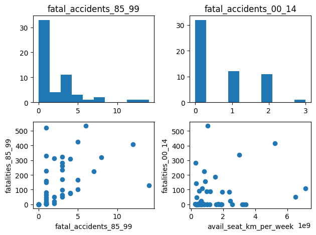
# Histogram - fatal_accidents_85_99
arr_ax[0,0].hist(data['fatal_accidents_85_99'])
arr_ax[0,0].set_title('fatal_accidents_85_99')
# Histogram - fatal_accidents_00_14
arr_ax[0,1].hist(data['fatal_accidents_00_14'])
arr_ax[0,1].set_title('fatal_accidents_00_14')
# Scatter - fatal_accidents_85_99 vs fatalities_85_99
arr_ax[1,0].scatter(data['fatal_accidents_85_99'], data['fatalities_85_99'])
arr_ax[1,0].set_xlabel('fatal_accidents_85_99')
arr_ax[1,0].set_ylabel('fatalities_85_99')
# scatter - avail_seat_km_per_week vs fatalities_00_14
arr_ax[1,1].scatter(data['avail_seat_km_per_week'], data['fatalities_00_14'])
arr_ax[1,1].set_xlabel('avail_seat_km_per_week')
arr_ax[1,1].set_ylabel('fatalities_00_14')
plt.tight_layout()
plt.show()
# https://www.machinelearningplus.com/plots/top-50-matplotlib-visualizations-the-master-plots-python/
# https://levelup.gitconnected.com/an-introduction-of-python-matplotlib-with-40-basic-examples-5174383a6889
import pandas as pd
import numpy as np
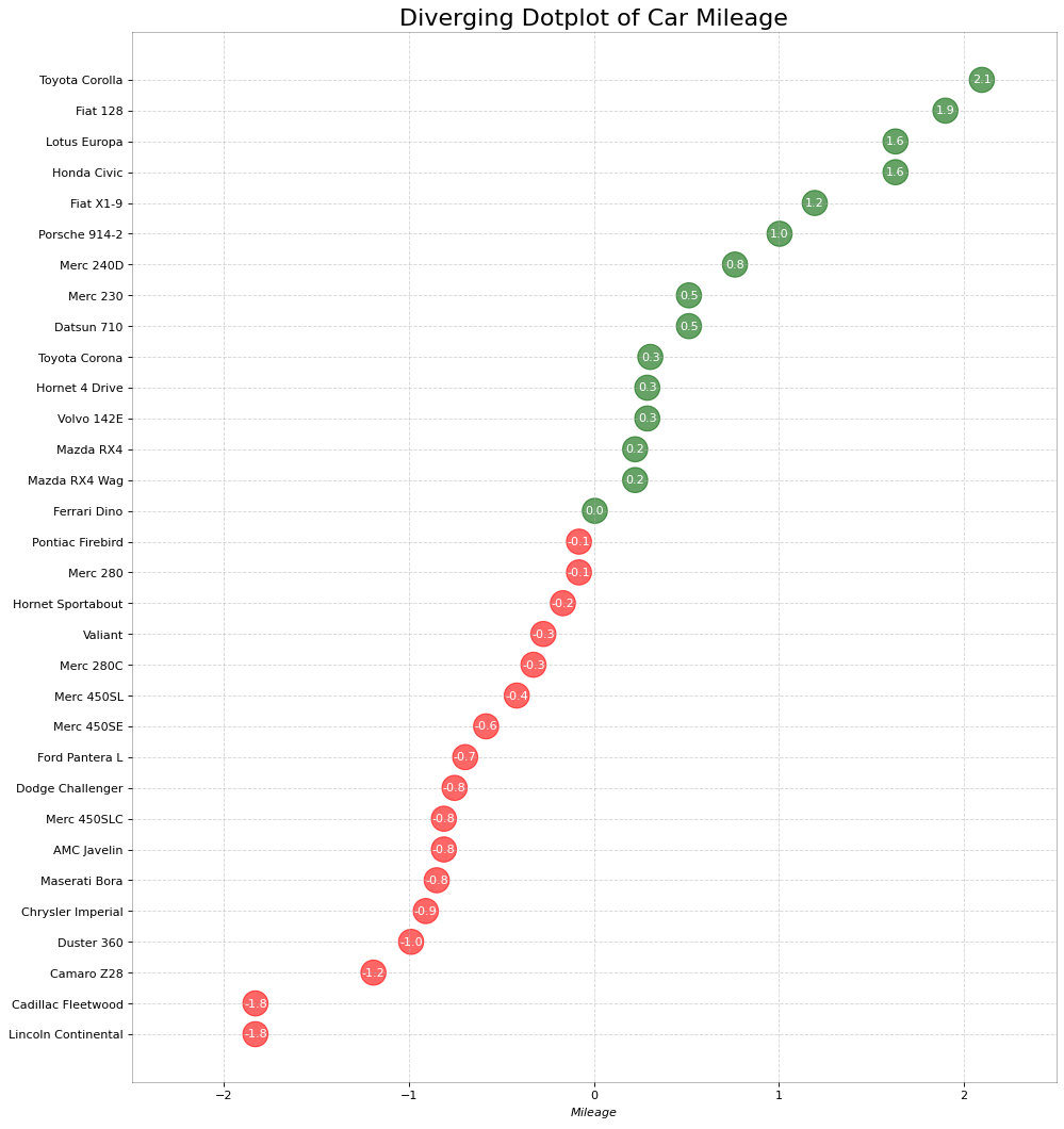
# Prepare Data
df = pd.read_csv("https://github.com/selva86/datasets/raw/master/mtcars.csv")
x = df.loc[:, ['mpg']]
df['mpg_z'] = (x - x.mean())/x.std()
df['colors'] = ['red' if x < 0 else 'darkgreen' for x in df['mpg_z']]
df.sort_values('mpg_z', inplace=True)
df.reset_index(inplace=True)
# Draw plot
plt.figure(figsize=(14,16), dpi= 80)
plt.scatter(df.mpg_z, df.index, s=450, alpha=.6, color=df.colors)
for x, y, tex in zip(df.mpg_z, df.index, df.mpg_z):
t = plt.text(x, y, round(tex, 1), horizontalalignment='center',
verticalalignment='center', fontdict={'color':'white'})
# Decorations
# Lighten borders
plt.gca().spines["top"].set_alpha(.3)
plt.gca().spines["bottom"].set_alpha(.3)
plt.gca().spines["right"].set_alpha(.3)
plt.gca().spines["left"].set_alpha(.3)
plt.yticks(df.index, df.cars)
plt.title('Diverging Dotplot of Car Mileage', fontdict={'size':20})
plt.xlabel('$Mileage$')
plt.grid(linestyle='--', alpha=0.5)
plt.xlim(-2.5, 2.5)
plt.show()
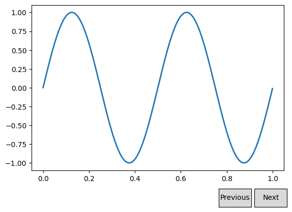
import numpy as np
import matplotlib.pyplot as plt
from matplotlib.widgets import Button

freqs = np.arange(2, 20, 3)

fig, ax = plt.subplots()
fig.subplots_adjust(bottom=0.2)
t = np.arange(0.0, 1.0, 0.001)
s = np.sin(2*np.pi*freqs[0]*t)
l, = ax.plot(t, s, lw=2)


class Index:
    ind = 0

    def next(self, event):
        self.ind += 1
        i = self.ind % len(freqs)
        ydata = np.sin(2*np.pi*freqs[i]*t)
        l.set_ydata(ydata)
        plt.draw()

    def prev(self, event):
        self.ind -= 1
        i = self.ind % len(freqs)
        ydata = np.sin(2*np.pi*freqs[i]*t)
        l.set_ydata(ydata)
        plt.draw()

callback = Index()
axprev = fig.add_axes([0.7, 0.05, 0.1, 0.075])
axnext = fig.add_axes([0.81, 0.05, 0.1, 0.075])
bnext = Button(axnext, 'Next')
bnext.on_clicked(callback.next)
bprev = Button(axprev, 'Previous')
bprev.on_clicked(callback.prev)

plt.show()